Get Paid To Promote, Get Paid To Popup, Get Paid Display Banner

Yellow Fever

It's Feb 25th and I am anxiously awaiting Spring. Yellow reminds me that it is just around the corner. Forsythia blooming, tulips nodding their heads to me at the Flower Shops, a bowl of yellow lemons are all live touches of yellow we can add to our homes. But what about using yellow in more permanent installations in your home to add a dash of sunshine and warmth year round. Color researchers believe the color Yellow increases self-esteem and strengthens the overall well-being. Yellow to me is happy, bright, optimistic and interestingly enough it is the color that has the longest memory retention. So yellow is a good color to paint your house when you are wanting to sell it.....because yellow houses sell faster. Also yellow cars have been proven to have fewer accidents.

House Beautiful March08

Forsythia, yellow tulips & fresh lemons on classic Carrera marble countertops

House Beautiful March 2008

SouthernAccents

Yellow Pottery, lemons, bananas, and pineapple in this beautiful all white kitchen

Southern Accents

colorams se

Classic contemporary yellow chairs

Simple

A contemporary way to add a splash of color in your rooms, which is easy to change out for a new look.

jan showers com 02

Jan Showers uses touches of yellow for punch in this room

Elle Decor 2007 Laird Residence Bilhuber Designer1

Jeffery Bilhuber has used National Geographic magazines to get a pop of yellow into this warm and inviting sitting room

 via mrs blandings

This is such a bright welcoming entryway with my favorite Gracie Studio Wallpaper. Photo via Mrs Blandings

parish hadley reception via Peak of Chicalbert hadley june 2000 HB

I like the way Interior Design icon, Albert Hadley uses yellow as an accent color for furniture. The picture on the right is a room in his own home and on the right is his office.

tessellations org1 david hicks2

A beautiful "tessellation" tile (left) & David's Hicks's masterful use of bright acid yellow (right)

british homes and gardens via memyselfI

curtains

img17janshowers westerninteriors via katie did

I love the billowy yellow silk draperies in these rooms

credenza designed by the fabulous Tommi Parzinger via Jackie Blue Homepurplearea blogspot

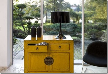
A classic credenza designed by the fabulous Tommi Parzinger (top) & A painted Chinese chest (bottom)


Some yellow inspiration from my last trip to LA. That is velvet on the ottoman on left picture. The picture on the right is from an accessories showroom showing their spring and summer line for 2008. I definitely saw a trend for yellow for this year in home furnishings and accessories.

david hicks1

This is a room David Hicks designed in the 70's and it is still vital and current 30 some odd years later. He uses yellow sofas and chairs in his design much the same way as Albert Hadley.

katrincargillJan Showers

A beautiful yellow wallpaper in this room by Katrin Cargill Creamy (left) & butter yellow painted walls by Jan Showers (right)

yellow lamps

Yellow lamps add a vibrant shot of color in this black and white bedroom, and notice the interesting cushion on the bed

design inc tovas deck

Classic yellow striped cushions

Postcards.indd

I love the bold use of yellow on this floor...now that takes chutzpah

antique chairs

Magnificent antique Directoire chairs

Happy Weekend

Click here to watch this extraordinary video.

Prescription for Bliss: The Dog, the Cat and the Rat
I couldn't resist sharing this wonderful video clip with you...the moral of the story to me is: Why can't we all just be friends. Here's to World Peace!!
This is a video of one of the homeless in Santa Barbara and his pets. They work State Street every week for donations. The animals are pretty well fed and are mellow. They are a family. The man who owns them rigged a harness up for his cat so she wouldn't have to walk so much (like the dog and himself). At some juncture the rat came along, and as no one wanted to eat anyone else, the rat started riding with the cat and, often, on the cat! The dog, will stand all day and let you talk to him and admire him for a few chin scratches. The Mayor of Santa Barbara filmed this clip and sent it out as a Christmas card.

Click here to watch this extraordinary video.

Fornasetti Carpets

Fornasetti wallpapers are beautiful, well-made and bang on trend. My favorite ‘Tema e Variazioni’ inspired by the enigmatic face of a beautiful woman he came across in an old French magazine.

wallpaper

Piero Fornasetti was born in Milan (1913-1988) and became an eclectic painter, sculptor, interior designer, craftsman, engraver of art books and organizer of international exhibitions and events. Believing strongly in disegnothe practice of sketching and copying – as the legacy of the Italian artistic tradition, his unique style shows a strong sense of irony. He worked independently of the avant-garde and his production of exquisitely made objects, textiles and furniture, some of which are in the V&A Museum, is one of the largest of the 20th century.

Fornasetti's latest collection transfers the work this Milanese artist and interior designer into bold carpets. I love the bold whimsical nature of them.

Bacio

Bacio

How great would this area carpet be in an entry foyer

Buona_Notte Viso

Buona Notte / Viso

These area carpets feature the enigmatic face of a his beautiful French woman - one with eyes open and one with eyes closed

Serratura Mano

Serratura / Mano

How great would these carpets be in a hallway

Cortile_BW Pavimento

Cortile / Pavimento

These carpets are so enigmatic and remind me of a beautiful silk scarf in the manner of Hermes or Gucci.

OrtensiaSerpente

Ortensia / Serpente

For a little more spice or drama a beautiful leaf in the botanical style or the symbolic serpentine.

Which one is your favorite pick?

The Color Orange & Gracie Studio Wallpaper

I just received the email below from Jennifer Gracie and she sent along with it this image of the most beautiful and luscious wallpaper that her office is papered in! Lucky you Jennifer....thanks for the image. BTW I am a big fan of Gracie wallpaper and you can see why. Click here to read the interview I did with her brother Mike.

SY-233

Dear Patricia,

I think your blog is fantastic, and I do look forward to it's updates. I believe you interviewed my brother, Mike, for it in the past. I was reading your most recent on orange color while sitting in my office with it's handpainted scenic with an Hermes-y orange background!

I've sent you a photo, which I thought you might like, given that orange is your subject of the week.

Best regards,
Jennifer

Jennifer Gracie
Gracie, Inc.
419 Lafayette Street
New York, NY 10003
www.graciestudio.com

Washington Post

I was excited to find out that my post on "The Color Orange"

Tulips Patricia Gray Feb 08

along with Joni's post on "Blue Opaline"

image

had been featured on the Washington Post's "Blog Picks" last Thursday. The same article was then picked up by my local newspaper The Vancouver Sun and also by the Seattle Times and the LA Times. Thanks to Terri Sapienza of the Washington Post!

image

Design Watch: Praise for the powers of orange and blue

By Terri Sapienza

The Washington Post

Our picks to click this week:

Patricia Gray posts on the color orange, calling it "mentally stimulating" and worth considering for a dining room, library or child's room. Need a little more convincing? Check out the interiors that accompany this post and you, too, may feel the need to lacquer your ceiling the color of a Hermès box. http://www.patriciagrayinc.blogspot.com/

• On Cote de Texas, the color of choice is blue. Blue Opaline, that is. It's an antique, handblown glass from France. Though blue is the most popular color of Opaline, according to the blog, the glass can be found in green, white, pink and red. The rarest color of all: lemon. Read a brief history and see lots of fabulous photos. "One piece is just as beautiful as a hundred pieces are," the blogger writes. http://www.cotedetexas.blogspot.com/

image

image

image

Happy { Green } Weekend

eric piasecki photography


This weekend I am dreaming of GREEN. I am craving Green. It has rained all week. Maybe by resting my eyes on beautiful images of green I will absorb some of it by osmosis. It's worth a try. Ferns and more ferns in these pictures. The color green signifies growth, renewal & health. I like the simplicity of the above arrangements - clear glass and light, airy, deepest green ferns & leaves arranged with perfection........have a great weekend!!!

design public michael van valkenburgh associates1

design public michael van valkenburgh associates

Top photo Eric Piasecki Photography
Middle & Bottom photo Michael Van Valkenburgh Landscape Architects

Benjamin Moore Paint and The Color Orange


Tulips Patricia Gray Feb 08
Benjamin Moore Paint and the Color Orange

Orange is a color that is mentally stimulating as well as sociable. Colorists say that it can be used it to get people thinking or to get them talking. What a good color to use in a dining room, library, or child's room.

I purchased this bouquet of Parrot Tulips this weekend while I was shopping at our local market. I was stopped dead in my tracks when my eyes hit upon them. Of all the myriad of flowers on display, these definitely jumped out at me and have been my inspiration for this post.   These flowers will sit on my desk this week and it is my intention that they will enhance my creativity. I hope you find these pictures stimulating.

bilhuber3hermesnyc

Hermes orange is a word that conjures up an image in one's mind.
Who would not love to have a lacquered ceiling the color of a Hermes Box like this room that Jeffery Bilhuber has created.

Benjamin Moore Paint 2013-30 Jeweled Peach ekb interiors     Benjamin Moore Paint 2013-30 Jeweled Peach Pieces

Benjamin Moore Paint 2013-30 Jeweled Peach
Try orange with a dash of fuchsia.
EKB Interiors, Pieces

Benjamin Moore Paint 2013-20 Orange Nectar donovanBenjamin Moore Paint 2013-20 Orange Nectar  

Benjamin Moore Paint 2013-20 Orange Nectar
I love the shots of Orange in this otherwise White Room. Notice the skirted table in the background.
Donovan, Elle Decor

Benjamin Moore Paint antonia hutt  Benjamin Moore Paint Tom Scheerer

per·sim·mon (pər-sĭm'ən)

Sometimes only the color of a fruit can conjure up images of a color. Persimmon is one that vividly brings to mind a
whole range of the color orange. How friendly and inviting to paint an entry foyer in this color.
Antonia Hutt, Tom Scheerer

Benjamin Moore Paint 2171-30 antonia hutt Benjamin Moore Paint 2171-30  

Benjamin Moore Paint 2171-30 Adobe Orange  is warm and vibrant
Antonia Hutt, David Hicks

Benjamin Moore Paint  2166-40 Soft Pumpkin

Benjamin Moore Paint  2166-40 Soft Pumpkin
Antonia Hutt

Benjamin Moore Paint  2015-30 Calypso Orange  Benjamin Moore Paint  2015-30 Calypso Orange

Benjamin Moore Paint  2015-30 Calypso Orange
Mecox Garden

rangdecor blogspot
The oranges of India via Rangdecor Blog

Burnhamdesignjaysonhomeandgarden com   vase

Benjamin Moore Paint Mandarin Orange
Burnham Design, Jayson Home and Garden

kwid david hicks
Benjamin Moore Paint Outrageous Orange
KWID, David Hicks

frances-elkins-room4 david hicks  12

blood orange (n.) A sweet orange having pulp that is red or streaked with red
Francis Elkins, David Hicks

davidduncanlivingston  david hicks3

Benjamin Moore Paint 2170-20 Tropical Orange
David Duncan Livingston, David Hicks

Patricia Gray writes about Interior Design inspirations, emerging trends, and the world of Design. 
While you're here, subscribe to this feed so you don't miss out.
© Patricia Gray Interior Design Blog, 2009

Related Posts Plugin for WordPress, Blogger...